How This. Onboards New Users
13 January 2016I was really impressed by the thoughts Andrew Golis discussed in his blog post ‘I drew a bunch of dots to explain why social media is broken’.
Andrew explains how the strategy that many media companies take to promote content on social media are leaving our news feeds homogenous, as well as a little less human. This leaves the content that we consume everyday not as inspiring as it could be.
These problems are attempting to be solved by ‘This.’, of which Andrew is the founder and CEO.
This. lets users follow publishers (people and companies) you trust, sharing stuff they recommend and/or made. But every member is limited to sharing just 1 link a day.
That 1 share limit doesn’t just stop this arms race before it starts. It turns every publisher’s share into something even more valuable: a statement of passion. When the publishers you trust make their pick, they’re telling you: “This is what’s worth your time today.”
Since I found This. to be such a refreshing take on consuming content on the web, I thought I would do a teardown of the onboarding process. This is inspired by useronboard.com.
One/Thirteen
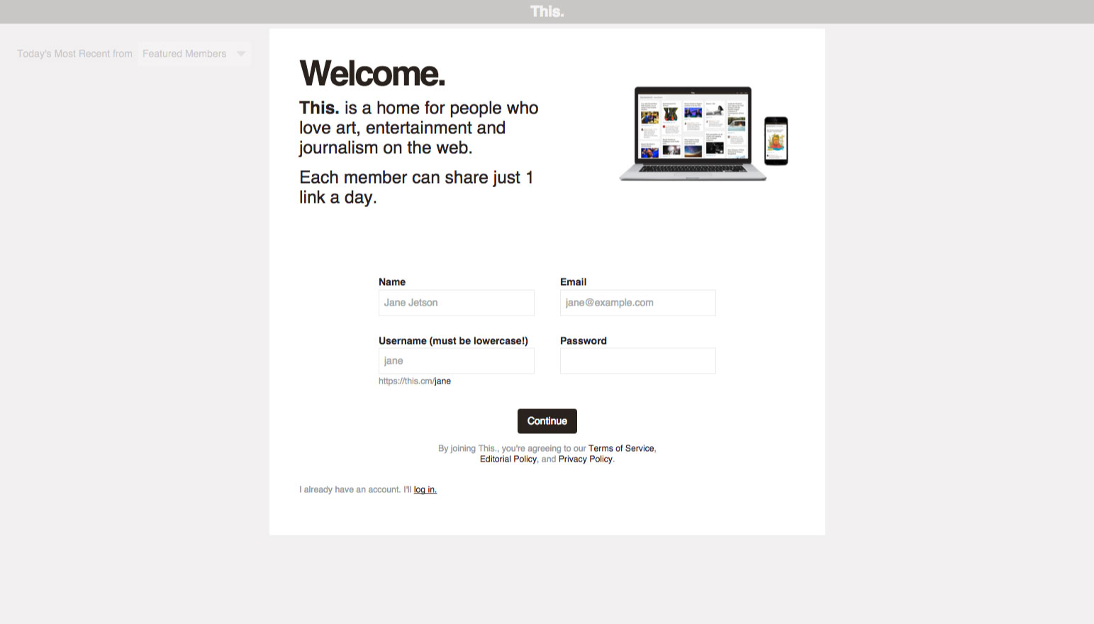
Nice idea to be able to see a glimpse of the final interface to give the user context as they’re signing up. However, the onboarding windows appears to be part of the main UI – perhaps, dare I say, a drop shadow to add visual depth and contrast would help suggest that the onboarding window is temporary?
It would also be nice to see some example posts in the UI underneath to give the user even more context.
A fairly clear value proposition explaining who will like This. However, it doesn’t explain why only being able to post ‘just 1 line a day’ is beneficial.
Anyways, I happened to have come from the blog post, lets get started!
Two/Thirteen
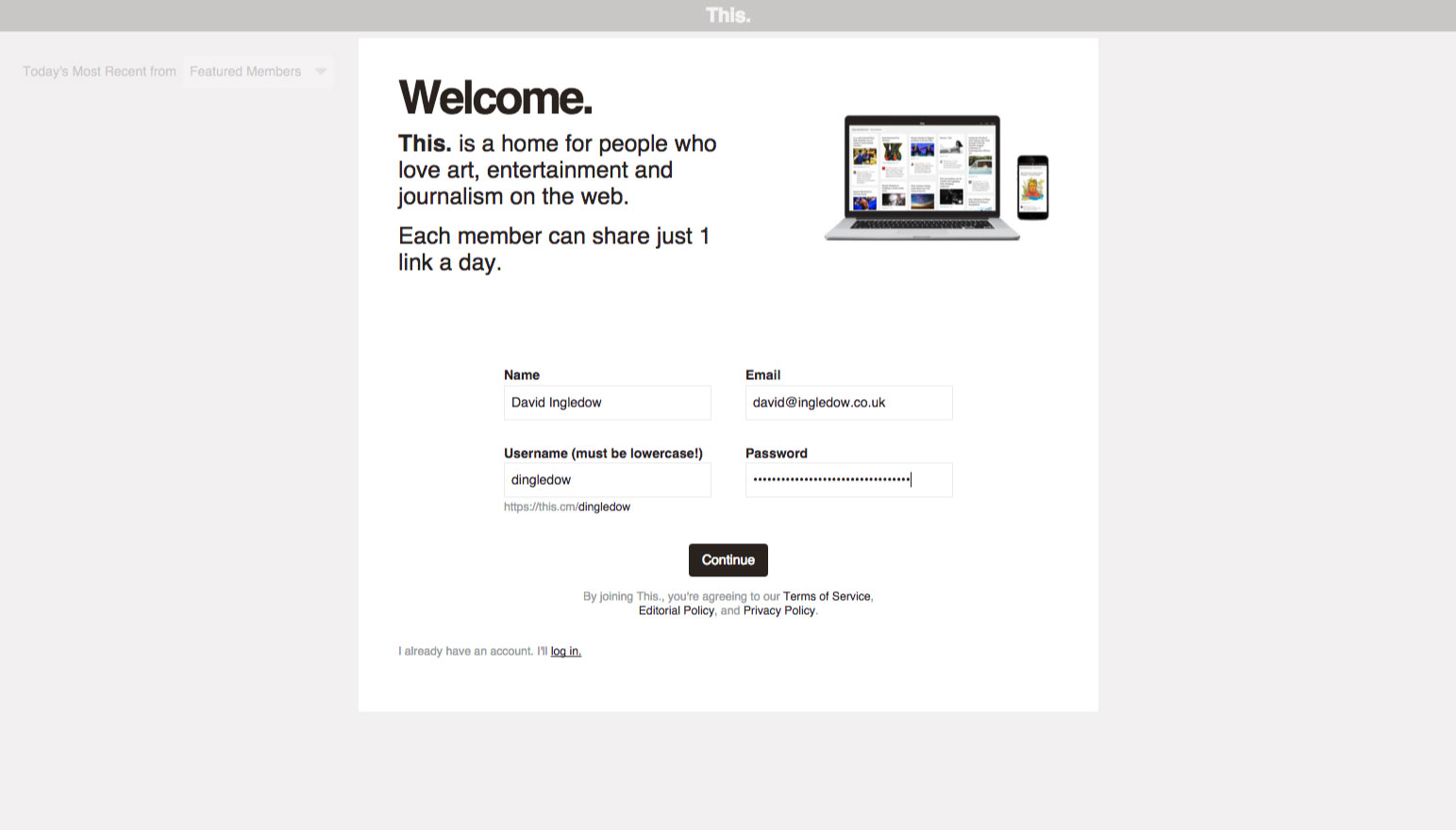
Entered my details but noticed there was no guide on what the password should be – the system actually allows a 1 character password.
I’m a supporter of Joel Califa’s Password Security Guide design pattern, which aims to educate users on using strong passwords, rather than enforcing overly strict password rules on users.
Three/Thirteen
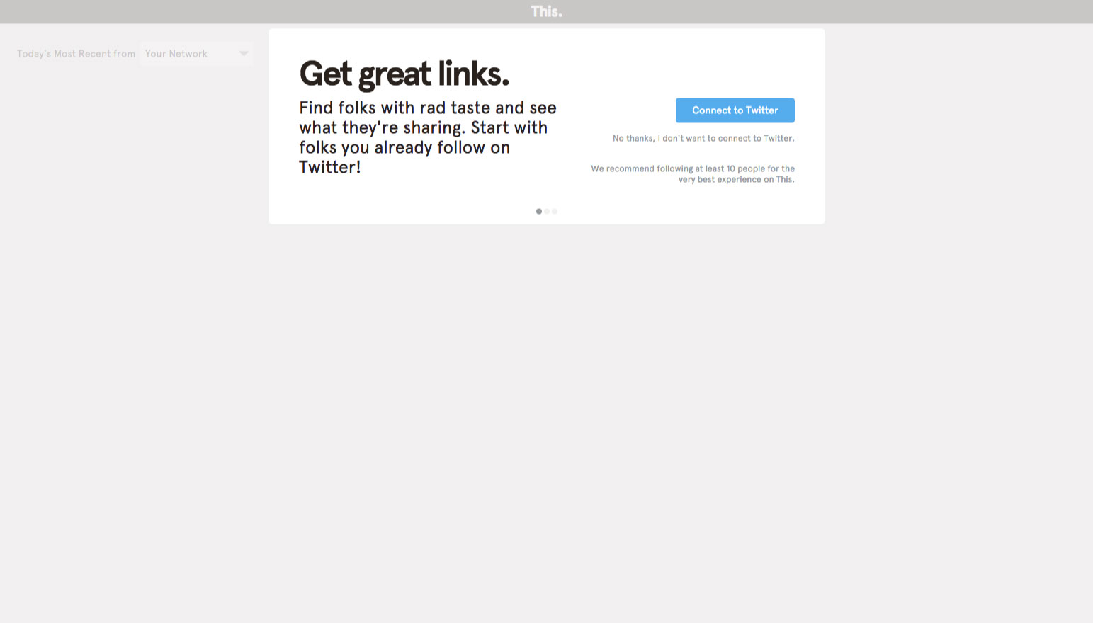
Nice value proposition for connecting my Twitter account. Although, would be nice to make the ‘No thanks, I don’t want to connect to Twitter’ option look a bit more clickable – perhaps an underline?
Four/Thirteen
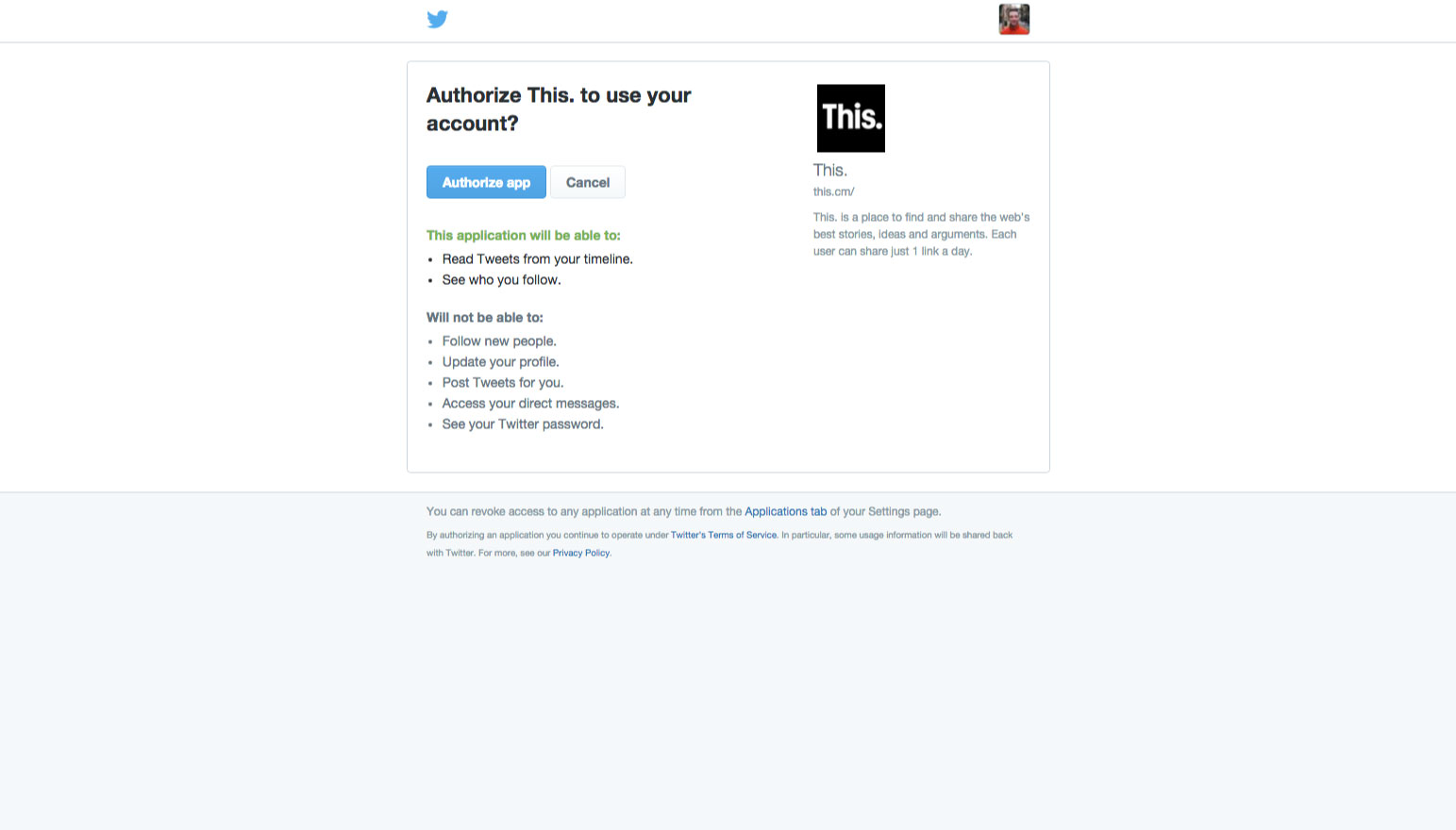
Very good to see that This. are not asking for all permissions under the sun, just the ones necessary to validate your account and see your followers.
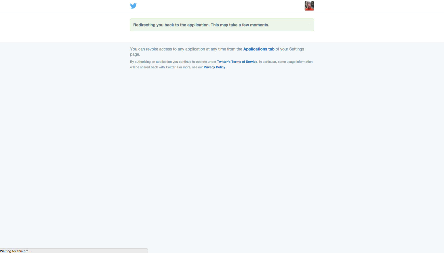
Five/Thirteen
Beam me up, Scotty!
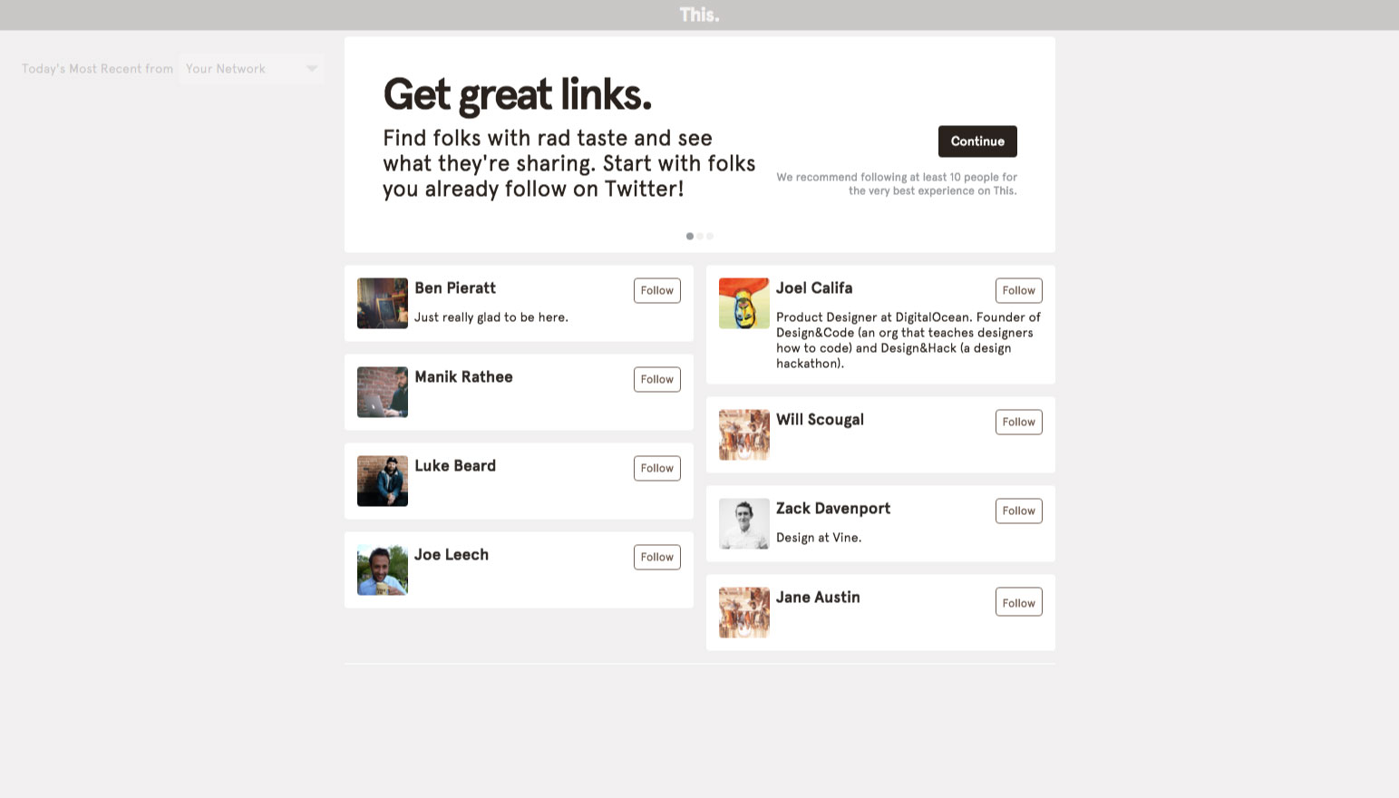
Six/Thirteen
Not sure why the copy for this stage is the same as step three. I’ve already connected to Twitter so surely the copy should be more along the lines of:
‘Here are the folks on Twitter you know. Follow them to see what they’re sharing.’
Also, tried clicking the three dots which are normally interactive and indicate a carousel. This isn’t the design pattern here. The three dots show what stage of the onboarding process we’re at. This would be a lot less confusing if it was more clearly a progress indicator.
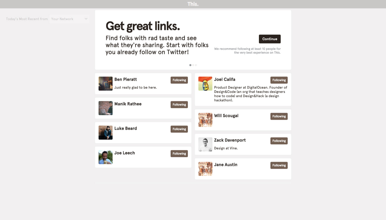
Seven/Thirteen
I decided to follow them all. Let’s continue!

Eight/Thirteen
Great value proposition again. Lets see who else we can follow.
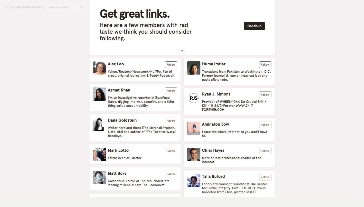
Nine/Thirteen
Uh oh! Looks like this page doesn’t have any more content when I scroll even though I can see the top of the next user in the list.
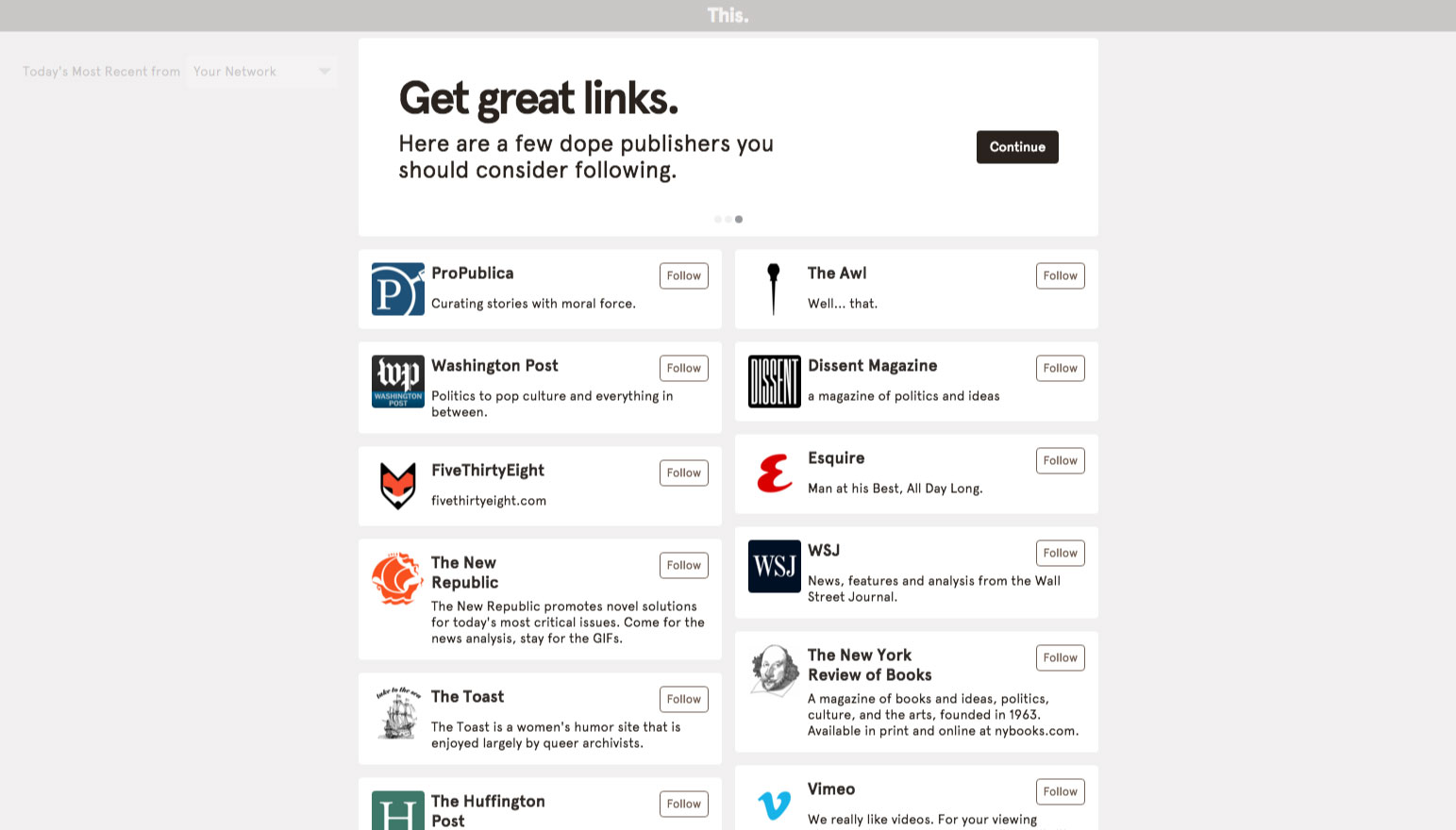
Ten/Thirteen
Value proposition is clear and keeps the tone of voice consistent with the ‘rad’, ‘cool’, ‘dude’, ‘bro’ vibe This. have got going here.
Downside, this page has the same issue as step nine – the content is missing when I scroll.
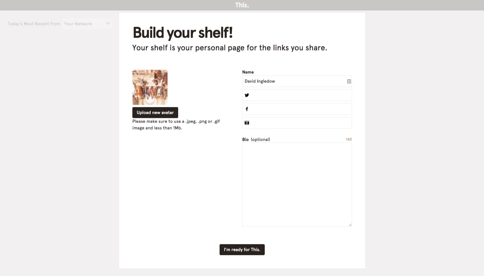
Eleven/Thirteen
Not quite sure on the need for calling what is effectively my ‘profile’, a ‘shelf’. Anyways, the copy makes it fairly clear that this is where all my published links will be shown. It may be helpful to explain that ‘my shelf’ can be seen at this.cm/dingledow on this page.
Not sure why I need to upload an avatar or enter my Twitter username when I’ve already used Twitter to authenticate and sign up. This. should already be able access this information.

Twelve/Thirteen
Uploaded and added the information manually.

Thirteen/Thirteen
Boom! Here’s to what should be a more valuable, less homogenous feed of content!
